Typeface Info
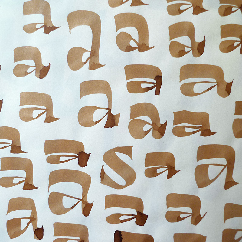
Xunga is a playful bold font. My goal was to design a typeface able to fit any layout with boldness and cheerfulness, mixing a sign painter taste in the uppercase and some of my crappy calligraphic reverse contrast explorations with the flat brush for the lowercase.
I designed several of widths to fit the page, and though about a different way of expanding the family shifting the horizontal stress axis to move the letter weight in different heights, making a 15 fonts family, suitable for making bold layouts.
Xunga has an extended character set for European languages as well as Vietnamese, and shows all its potential with OpenType-savvy applications. Every font includes ligatures, catchwords in discretional ligatures, contextual alternates to avoid conflictive glyph pairs and localized forms to avoid problems with several glyphs and languages.
Although it wasn’t a conscious aesthetic inspiration, I think Xunga, which could be translated as Krappy, has also something to be with the old lettering art in my childhood comic books, somewhat naive and charming in its imperfection. Sometimes drawn by the artists themselves, sometimes by editorial staff, those whimsical letters were the first lettering I came across in my life. For me there’s a lot to learn from the old magazine’s unknown lettering workers skills and their unmistakable charm. Their history is yet to be written, isolated from the canonical history of Spanish modern design.
…or scroll down for Styles, Test Samples and detailed Buying Options.

Xunga 5 widths, 3 stress heights. 15 fonts
Glyphset 632 glyphs
Designed by Juanjo López
Year 2017