Matusalem
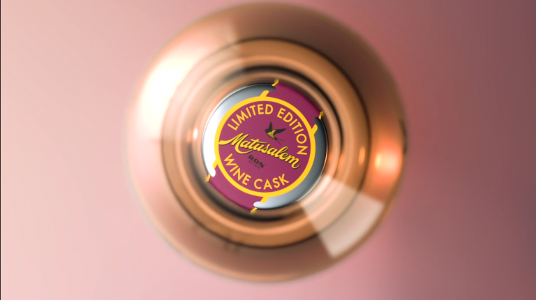
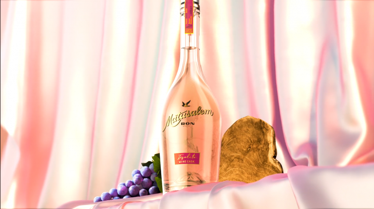
Logo for Matusalem, an almost 150 years old cuban rum brand.
They contacted me to refresh their logotype within a plan to renew the brand concept in all aspects. Matusalem design was old fashioned and too attached to a pirate look. My task was to renew the lettering without losing the brand’s proud history.
When I studied their logo, some strange flaws made me realize that it was a poorly digitized version of a lost logo made by a good lettering artist who had been losing quality in each adaptation. A little research showed the steps the logo had taken to get to its current appearance, evolving with media, country or technology changes.
We are faced with the doubt of whether to reinforce the traditional values of the brand by returning to the aesthetics of that lost logo or whether to take a step forward towards a new logo for the 21st century. Finally, the modern concept was the one that came forward and now is gradually being implemented in Matusalem products.

