Articles
Pliego: Playing Venetian old style
1. A rectangular piece of paper or parchment, especially one on which to write.
2. A textface designed to offer a comfortable continuous reading, with humanist proportions, an even texture, and informal calligraphic details noticeable only at big sizes, that gives it a contemporary feeling. It includes five weights with matching italics, several sets of figures, small caps in all weights and lots of OpenType features.
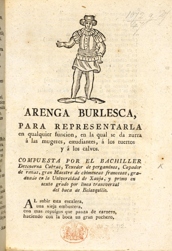
Pliego has been named after Pliegos de Cordel, the Spanish word for the popular books that were common during the XVI, XVII and XVIII centuries. These were rough, cheap books that basically consisted in a folded sheet attached to a string, hence the name. Their content was varied, from popular tales to ballads and songs, but also crimes and mysteries.
They were cheaply made, roughly printed and bound and used to be sold by chaps, who gave their name to those Chapbooks. Have a look to the Spanish Chapbook collection on the University of Cambridge Digital Library.
The name Pliego (sheet) evokes the idea of the old language of the printing trade, but also a rough look, angular edges, informal taste, but classical look.

Arenga Burlesca. Burlesque Allocution.
Image: University of Cambridge Digital Library.
In love with Aldo Manuzio
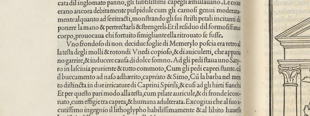
The idea of making an humanist typeface stroke me at the Aldo Manuzio exhibition in Madrid’s National Library in 2015. With my nose against a glass inspecting the Hypnerotomachia Poliphili (The Dream of Poliphilus) I was just overwhelmed by Griffo’s strong and even face. The word text as coming form latin for fabric, textus, never was so clear for me.

Hypnerotomachia Poliphili. 1499, Aldo Manuzio. Image: Metropolitan Museum of Art.
I though about trying to convey that sense of eveness and the smooth blackness of the letterpress print, but I didn’t want to study or digitalize high res scans of Griffo type. I just keep that sensation several months in the back of my mind to make a revival of my sensation, not the shapes, that lots of designers had been reworking for centuries.
Also, during those months I attended an interesting lecture by Joancarles Casasin at VLANC Festival about his approach to his work as typeface designer. In some moment he showed an image of an experiment: a formal old style typeface with an intentionally loose drawing. I keep that idea of getting a good lecture texture with an uneven drawing. Also, I didn’t search on the internet for the full lecture to know if my interpretation of Joanca’s point was right. I just wanted to try that loose drawing with my Venetian Old Style typeface.
Approaching Venetian Style
I was working on Schotis while planning and drawing sketches for the new project. While in Schotis every design decision was intentionally conventional, now I wanted to have fun risking with the letterforms. Before each design doubt, I always choose the boldest option, which sometimes affected the rest of the design.
I worked in Pliego from the beginning in all the weights and italics as you work in a sculpture, with a shapeless mass that you are removing and adding while going around searching for flaws. Each little change affects what you see from another angle until everything finally fits. I like that way of working, it fits me better than the logic of going step by step with thoughtful decisions that will never change.
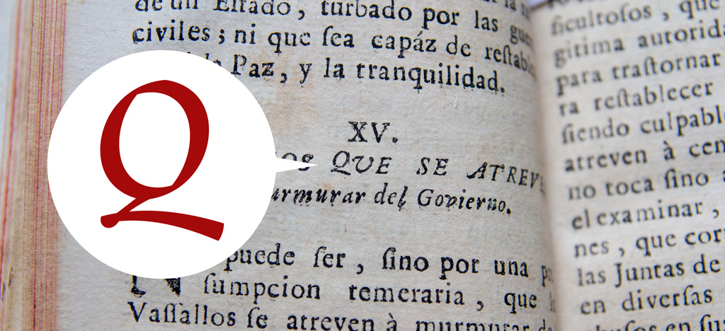
I did not look for scans of the books of Manuzio or similar, but when I needed references of style or had doubts about some character I chose as a model a book bought years ago in the fleamarket of Madrid: La Verdadera Política de los Hombres de Distinción (The True Politics of Men of Distinction), a book on how to behave in every aspect of life, printed in Barcelona in 1726. It is not an especially luxurious or well printed book, but the details and flourishes of some letters have ended up coming to Pliego.
In addition to get some design help, I have become a truly distinguished man so all are advantages.

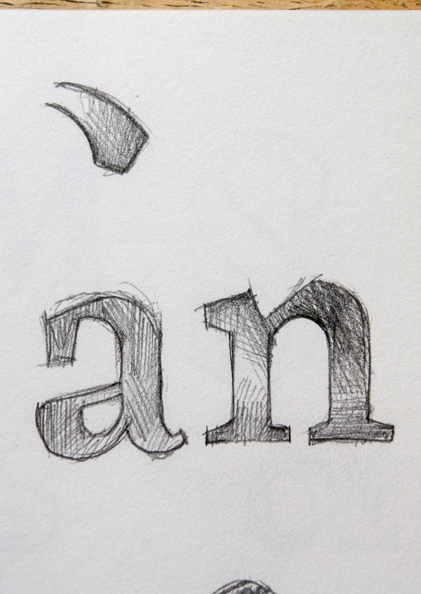
Sketches of Pliego.

My italic Q came from La Verdadera Política de los Hombres de Distinción. 1732. Valerio de Borxa y Loaiso.
To cover today’s needs, Pliego includes five weights with matching italics. Designed and engineered for continuous reading, the Book, Regular and Medium weights will perform at their best under 14 points. However, don’t be scared to use for headlines and titles: because of its quirky details and calligraphic flavour, Pliego’s personality is accentuated when enlarged.
With an extensive Latin character set, Pliego covers a wide amount of Latin-based languages, including Latin Plus encoding and Vietnamese support.
Every font includes small caps, ligatures, swashes, old style, lining, proportional and tabular figures, superscript, subscript, numerators, denominators, and fractions.
Pliego has been a long & hard work, thanks to Joana Correia, Donny Truong, Elena Veguillas, Noe Blanco, Ana Moliz and the Cañas & Tipos crew for making it easier.